Part 4: State Flags that Totally Suck
Behold Idaho's state flag: another effing state seal in the middle of an effing blue field! Aargh! To add insult to psychic injury, it clearly says "Great Seal of the State of Idaho" in the border around the seal, and yet there's also a fancy device below saying STATE OF IDAHO, in case we've become confused. Inside the seal are more words: "Esto perpetua" (it is forever), beneath which are two vistas, one inside the other, packed with allegorical imagery. The elk's head is probably the best thing in it. It should maybe be the only thing, blown up really big on a field any color but blue.

This flag is also fairly obnoxious, for reasons that should be familiar by now; it says KANSAS in big bold letters, and other than the sunflower up at the top, that's the best thing it has going for it. I'll suggest right off the bat that they scrub everything but the sunflower off this wreck, which also features blue and yellow rope - what is with that? - and a farmer plowing a field with two horses, and some Indians chasing bison, and a couple of covered wagons that seem to be drawn by swine heading away from a house with a chimney, and a sun setting over purple mountain majesty, and a steamboat on some body of water, and 34 stars (don't ask), and a banner with the Latin words "Per aspera ad astra," meaning "through difficulties to the stars." From anywhere but close-up, all you can see of this, besides the sunflower and the word KANSAS, is a vague impression of a landscape with the sun setting behind it.

Kentucky's flag features the words, duh, COMMONWEALTH OF KENTUCKY on a, duh, blue field, above sprigs of goldenrod (the state flower), surrounding a way-too-tiny white disk in which Daniel Boone appears to be shaking hands with Henry Clay, accompanied by even more words - once again, "United we stand, divided we fall." The only thing I would keep is the sprigs of goldenrod.
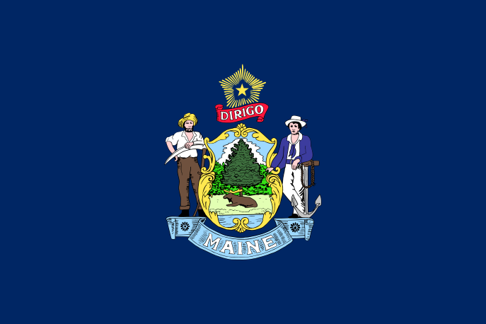
So here is Maine's flag: another pair of allegorical figures (a farmer and a sailor) flanking a shield full of state-seal-type symbolism, with the state's name spelled out below it, its Latin motto DIRIGO (I lead) above, and over all a single star surrounded by rays. Inside the shield, a moose reclines under a pine tree. Maine needs to decide whether its symbol is a pine tree, a moose, or a star surrounded by rays, and just go with it.

The Massachusetts flag would be greatly improved simply by making the emblem on it much bigger. It is currently so tiny that it looks downright stingy on that mostly empty white field. Most certainly illegible are the Latin words "Ense petit placidam sub libertate quietem" (By the sword she seeks quiet peace under liberty) running around the image of an Algonquian Indian holding his bow and arrow in a posture of peace. Also incorporated are a star, a length of rope, and a severed arm gripping a sword blade-up, which has some allegorical interpretation like "We would rather lose our right arm than forget that our liberty was achieved through warfare." Evidently the blue shield on a white field has some historic significance in the state's military history, so I'll refrain from suggesting that the whole design be replaced by either the severed arm with the sword or the Indian with the star at his shoulder. But what Massachusetts has right now is a flag that nobody can see. What's on it should, for starters, be bigger.

Alas Minnesota, another former home state of mine, thy flag totally sucks! There have been multiple versions of the Minnesota flag, each very different from the others, but all unified around the bone-headed idea of putting the state seal in the center of the flag. Among other design elements, some of which are practically impossible to identify with the naked eye, are the word MINNESOTA (again, admitting failure from the start), three dates (the founding of Fort Snelling, statehood, and the adoption of the first state flag), a wreath of the pink-and-white ladies' slipper (the state flower), the French words "L'Etoile du Nord" (star of the north), 19 gold stars arranged to suggest the points of a bigger star (Minnesota being the 19th state to be added after the original 13), and a ring of little gold circles representing all the counties in the state. At any distance, these circles look just like one continuous gold ring, rather spoiling the symbolism. Plus, the central image combines a scene of an Indian riding by on a horse, a farmer plowing his field, a gun leaning against a tree stump, some water nearby and trees in the distance, and I know not what else; you really have to zoom in to catch all the detail. Which is just plain ridiculous. Minnesota could just make a star out of 19 smaller stars, surround it with 87 tiny gold disks, and call it a flag.

That vexillological association I mentioned a while back, NAVA, determined Montana's state flag to be the third-worst state, territory, or provincial flag in the U.S. and Canada put together. They cited the tendency of flags based on a blue field to look alike, and the obnoxiousness of words and complex seals appearing on the flag - basically, what I've been saying all along. What it has going for it, though, and what makes it only mostly suck in my opinion, is that you can read the word MONTANA - which is a start, even if a bad one. It also contains the Spanish motto "oro-y-plata" (silver-and-gold), though much less visibly; a waterfall, a sunset, some farming and mining implements, and other scenic frou-frou that is almost too crude to identify, but which wouldn't improve the flag if they were depicted in vivid realism, because they're too tiny anyway. What this state needs is a crassly simple image that captures the whole idea of Montana - like, say, two horizontal bands, red on green, with a wavy blue line between them. People would look at it and say, "Hey! A river runs through it!"

This is the flag of Nebraska, another state in which I have lived, but not since I was old enough to vote. NAVA voted it the second-worst state, territorial, or provincial flag in the U.S. and Canada; and the one that made last place has already been replaced. So according to those who know, this is apparently as bad as they get. It's a blue field - again - with the state seal in the middle - again - and text around the edge of it telling you that it's the state seal - again - along with the month, day, and year of statehood. Inside the border of the seal are a ribbon bearing the motto "Equality before the law," and mountains, a train, a blacksmith at his anvil, a farm, a forest, a riverboat, etc., and the only reason I think it improves on Oregon's two-color flag is that it adds a third color (silver, in addition to gold and blue). The art might be slightly better, too. But there's just too much going on, more than a flag can carry well. Nebraska's state highway signs did it better, when they showed a simple illustration of a covered wagon, representing the pioneer trail. That's what needs to be on this flag - that and nothing else.

New Hampshire's flag, from the bottom up, comprises a blue flag (oh, Lord), with a ring of laurel sprigs and nine stars surrounding the state seal (yes, I know this tune: N.H. is the ninth state), and inside the border of the seal it tells you it's the seal of the state of New Hampshire (of course), then
another laurel wreath, and then an allegorical scene depicting the Revolutionary War frigate
Raleigh beached on yellow New Hampshire granite, with the sun rising over the sea beyond it and the stars and stripes waving from its stern. This epitome of all that sucks about state flags that suck needs to be replaced, like yesterday. A good start would be to clear out all the greenery, the words, and all the other stuff holding the picture of the
Raleigh down to microscopic size, and let the ship fill the canvas, as it were.
Here's the front, or obverse, side of Oregon's flag, which I have already mentioned...

...and here's the reverse side. Obviously, not all flags look the same on both sides; some, particularly the ones with words or state seals on them, look on the reverse just like a mirror image of the obverse. Oregon is currently the only state that has a different design on the reverse of its state flag. Cutting to the chase, it would probably be a better flag if the reverse were the obverse, period. All this big, bold text - STATE OF OREGON, 1859 - and the crude, single-color state seal in the middle, smacks of a lack of aesthetic sense. I can detect an eagle, and a covered wagon, and a sunset, and mountains, and trees, and ships, and a ribbon that says "The Union," and some other stuff I can't quite identify, but that's about it. In the spirit of Woody Allen's "The food is bad, and the portions are too small," I would sum it up by saying the imagery is crudely executed, but it's not really the kind of imagery that should be on a flag. Flip back to the New Mexico flag, Oregonians, and try to work out what they did right and you did wrong. But I'll give you a hint: it's everything. Just keep the beaver and throw the rest away, and you may save Oregon from having the worst state flag in the country.

Guess what's on Vermont's flag! A blue field - check! The state's name and motto ("Freedom and Unity") - check! A shield framed by crossed sprays of greenery - check! It's got a deer's head at the top, growing out of one of those blue-and-gold rope devices. And inside the main body of the state seal, it depicts a tiny bull standing under a pine tree with some white sheaves of grain receding into the distance. The distance is what really makes it: first forests, then mountains, and then a full-color sunset. It's like a silk-screened painting - not something your arthritic old auntie is likely to embroider on her own. Vermont has a troubled history with its flags, including a couple versions that were confusingly similar to the U.S. flag. It really should go back to its first one, the Green Mountain Boys' flag, which had 13 stars randomly scattered over a blue canton on a green field.

Wisconsin's flag is so bad, it's hilarious. It, too, has gone through many versions, and all of them have been bad; but what started bad just kept getting worse. And now it's as bad as ever, with one of those state seals in the middle of a blue field (it's always been there, but not always so small), and WISCONSIN 1848 printed on it in huge white characters. The seal also incorporates the word FORWARD, a badger, and various images symbolizing sailing, farming, mining, and manufacturing, such as a cornucopia and a stack of lead ingots. To put it in the plainest language, there are three main problems with this flag: too much crap, packed in too small; stupidly huge lettering spelling out stuff that wouldn't have to be spelled out if the flag was doing its job; and the fact that it looks like about 30 other state flags, apart from the obvious lettering. I'm sure a big wedge of cheese would be more recognizable than this. The badger all by itself, if it didn't to closely resemble the beaver on the back of the Oregon flag, could do it. Heck, that quartered shield, with the arm and hammer, anchor, plow, pickax and shovel would do it, if blown up to fill the whole flag. That would also push away the hackneyed blue field, an obvious benefit.

West Virginia's flag from 1905 to 1907 bore a crude depiction of three sprigs of mountain laurel on a white field, surrounded by a blue border. Since then it has gone through several revisions to arrive at its current depiction of a state seal on a white field (oh, novelty!), surrounded by a blue fringe. The seal is topped by a ribbon naming STATE OF WEST VIRGINIA, and bottomed by the unreadably tiny motto "Montani semper liberi" (mountaineers are always free), with sprays of rhododendron wrapped around it and actually tied at the bottom with a bit of ribbon. The allegorical figures inside the shield, also too tiny to be made out distinctly except at high magnification, include a farmer and a miner, with the tools of their trade around them, and a pair of crossed rifles with a cap signifying liberty achieved through armed conflict, and at the very center a boulder with the date of statehood inscribed on it. It's so ugly, it causes pain. West Virginians are supposed to salute this flag with a pledge that goes on for more than 40 words, including "Mountaineers are always free." It would be an easier pill to take if it wasn't so fugly. The mountain laurel design would be better than this. Or maybe just the two crossed rifles with the cap on top.
Conclusion: The point of a state flag is to be a recognizable symbol of the state it belongs to. Too many U.S. state flags fail by placing similar imagery in the middle of more or less the same field of blue, at a scale that makes it hard to distinguish from other state flags. Some of them try to repair this defect by adding another to it: spelling out the state's name in block letters, which defeats the purpose of having a symbol tell you what you need to know. The many states whose flags partly or mostly suck should take more notice of the few that totally rule - not to copy their imagery (please!), but to understand what having a flag is all about. Then maybe they can design one that does what it is supposed to do.


2 comments:
I went through the other three posts, only to realize to my dismay that I would find my native state's flag here. Unfortunately, I can't offer much of a defense, as it's one of those blue-field derivatives...
Which flag did I miss?
Post a Comment