 It's got everything I wanted. It's got a long shelf of books. It's got the title and subtitle of the blog. It's just crummy, that's all. I find the text difficult to read, and the image doesn't fit the dimensions of the header correctly. Oh, well, back to the drawing board.
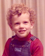
 Meanwhile, here's a closer look at the photo of "me" that I just added to my Blogger profile. It's not actually me. It's just a picture that I found on Google Images while searching for something else. As soon as I spotted it, I said to myself: "Self, that's a perfect image for A Fort Made of Books!" Except, well, it's oriented the wrong way. So I can't use it in the header, either.
Web design is gnawing at the edges of my mind, these days. I'm going to have to bone up on it, because there's a good chance the Book Trolley is going to become its own site. Once again, I owe this sudden nudge toward creative ambition to the unresponsiveness of the editors at MuggleNet, who have been publishing my book reviews since September 2003, when I started submitting reviews under the uninspired title of "Suggested Reading." We've come a long way since then... but in the last year, we haven't gotten anywhere much! Which is why literally dozens of my reviews, targeted primarily at MuggleNet readers, have gotten no further than this blog.


No comments:
Post a Comment